

Setting Plaster Farrow and Ball is a soft, warm paint colour that many people shortlist for calm rooms. It sits between pink, peach, and beige. That mix makes it hard to judge from a photo. A wall can look pink in one light and sandy in another. So it helps to know what you are choosing before you buy a pot.
This guide explains what the colour is and what its hex code and light value mean. You will see how light changes it, including in a north facing room. You will also learn what goes with it, how it can work in different rooms, and how it compares with Scallop. Last, you will find tips on dupes, sample testing, and common mistakes.
What Is Setting Plaster by Farrow & Ball?
Setting Plaster is a Farrow & Ball paint colour with the number 231. Third-party colour sites place it in the beige family, with a warm yellow-red undertone. One site calls it a dusty plaster pink. Another calls it a soft peach. These words differ, but they point to the same idea: a warm, gentle neutral with a hint of pink.
Think of it like the colour of fresh plaster as it dries. It starts rosy and then settles into a soft, earthy tone. That is why many people use it as a backdrop. It does not shout. It also leaves room for wood, fabric, and art. For the official description and current range, check the Farrow & Ball website or colour card.

Setting Plaster Farrow and Ball Hex Code and LRV
A hex code is a short code that tells a screen which colour to show. Many people search for the setting plaster farrow and ball hex code to match it in design tools. The problem is that sites do not agree. One database lists #DBC2B0. Another lists #DFC2AF. A third lists #D9C0AE. The brand’s own value may differ from all three.
LRV means light reflectance value. It shows how much light a surface reflects, from 0 for black to 100 for white. Third-party sites list Setting Plaster at about 57 to 58, which they class as light. Use these numbers as a guide only. Paint on a real wall looks different from a pixel on a phone. Always check a physical sample before you decide.
How Light Changes the Colour
Light changes how every paint looks. Daylight from the north is often cooler and bluer. In a north facing room, one site says the pink may look more muted and less warm. South facing light is warmer, so it can bring out the peach tones. East light is warm in the morning, and west light is warm in the afternoon.
Artificial light matters too. Warm bulbs can bring out the red and yellow in this colour. Cool white bulbs can make it look flatter. Before you paint a north facing room, look at it at three times: morning, midday, and evening. Then judge your sample at each time. A colour that feels soft at noon may look different at night.
Setting Plaster Farrow and Ball Colour Schemes
Colour schemes are easier when you pick one job for each colour. Setting Plaster works well as a calm base. One third-party site suggests lighter partners such as Pink Ground, and darker ones such as Dead Salmon or Templeton Pink. These keep the look warm and close to the same family. They suit people who want a soft, layered scheme.
For more contrast, try blue-green or deep tones. The same source lists colours such as De Nimes, Black Blue, and Hazy as complements. It also lists earthy partners such as London Clay, Mouse’s Back, and Stony Ground. If you wonder what goes with setting plaster farrow and ball, start with one partner colour. Add it to trim, a door, or a feature wall first. Then judge the result before you go further.
Living Room and Hallway Ideas
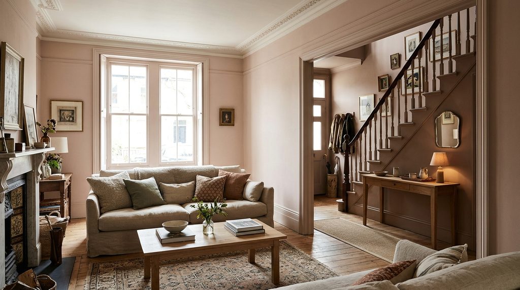
In a living room, Setting Plaster can make a space feel warm and settled. It pairs well with natural materials such as oak, linen, and wool. If your sofa is grey or blue, check that the pink in the wall does not clash with it. A sample next to your biggest furniture piece tells you more than a small swatch.
A hallway often has little daylight, so colour can look different there. Setting Plaster in a hallway may feel welcoming, but dark corners can turn it muddy. Test it near the front door and near the stairs. Hallways also get scuffs, so think about the finish. Ask the brand or your retailer which finish suits high-traffic walls.
Bedroom and Bathroom Ideas
In a bedroom, the soft pink-beige tone can feel restful. It may suit people who want warmth without a strong colour. Look at it by lamp light at night, because that is when you use the room most. A third-party site shows photo collections for bedrooms, which can help you picture it. Compare those images with your own light.
In a bathroom, steam and damp matter more than colour. Check which finish and paint type the brand suggests for wet rooms. One third-party database lists several finishes for the colour, but availability can change. Ask the brand or your retailer before you buy. Also test the colour next to your tiles. White tiles can make the wall look pinker, while cream tiles can make it look flatter.
Setting Plaster Farrow and Ball Kitchen Use
A kitchen has many fixed items, such as worktops, floors, and appliances. Those items may have their own undertones. Hold a sample next to them before you commit. Setting Plaster on kitchen walls can feel warm and gentle. On cabinets, it can make a room feel softer than white.
Kitchen cabinets take more wear than walls. They get touched, wiped, and splashed. So the finish is a key choice. Ask the brand or a trusted painter which paint and finish suit cabinets. Also check how much prep the job needs. A great colour will still look poor on a badly prepared surface.
Scallop vs Setting Plaster
People often compare Scallop with Setting Plaster. One colour comparison site lists Scallop as a lighter, slightly less warm colour. It gives hex values of #D9C8BA for Scallop and #D9C0AE for Setting Plaster. It describes the two as very close, with Setting Plaster the warmer of the pair. That site did not give LRV figures for the comparison.
So the choice may come down to mood. Setting Plaster leans warmer and a little deeper. Scallop leans softer and lighter. In a bright room, the gap may feel small. In a dim room, it may look bigger. Put both samples on the same wall and compare them side by side. Do that in daylight and by lamp light.

Dupes, Dulux, RAL and Colour Match
Many shoppers search for a dupe for setting plaster farrow and ball, including a Dulux version. A dupe is a cheaper or easier colour that looks close. Comparison sites list near matches from many brands. One database names Jotun, Behr, and Kelly-Moore colours as close on screen. None of these lists is an official match from Farrow & Ball.
RAL is a colour system used in many trades. Some sites compare Setting Plaster with RAL shades, but those matches are approximate too. A paint shop can scan a sample and mix a colour match. The result may still look different, because paint types and finishes differ. If you want the exact Farrow & Ball look, buy it from the brand or a stockist.
How to Test a Sample
A setting plaster farrow and ball sample is the best test you can do. Paint a large sheet of card or lining paper, about A2 size if you can. Leave a white border around it. Move the card to different walls. Look at it in the morning, at midday, and at night. Photos on a phone can shift the colour, so trust your eyes.
Test near furniture, floors, and curtains. Also hold it up next to your trim colour. If you are unsure, test a second colour beside it. Do not judge from a tiny swatch. Wait until the sample is dry before you decide. If your room has strong daylight, view it on a sunny day and on a grey day.
Common Mistakes With Setting Plaster
The first mistake is trusting a hex code or a screen image. Screens show colour with light, while paint reflects it. Another mistake is judging in one spot. A wall near a window looks different from a wall in a corner. People also forget the floor. A pink floor and a pink wall can look heavy together.
The fixes are simple. Check at least three spots in the room. Use big samples. Compare against your trim and your fabrics. Keep a record of what you saw and when. If the colour looks too pink, try a version with less warmth, or pair it with more neutral tones. If it looks flat, add warmer bulbs or richer accents.
Frequently Asked Questions
What number is Setting Plaster?
Setting Plaster is listed as number 231 in the Farrow & Ball range. Colour numbers help you find the right pot when you shop. Always match both the name and the number. Check the brand’s site or a stockist for the current range and finishes.
Is Setting Plaster pink or beige?
It sits between the two. Third-party sites call it a warm beige with a pink or peach tilt. Light, floors, and furniture change which side you notice. A large sample in your own room is the best way to see which side shows up.
Is Setting Plaster a good colour for a north facing room?
It can work, but test first. North light is often cooler, so the colour may look more muted. Warm bulbs can help it feel cosier. Compare it with other warm neutrals on the same wall. Judge the samples in the morning, midday, and evening before you buy.
Can I use Setting Plaster outside?
One third-party database lists it for interior and exterior use. This guide cannot confirm that for every paint type. Ask Farrow & Ball or a stockist which products suit outdoor surfaces. Outdoor light is also much brighter, so the colour may look lighter there.
What LRV does Setting Plaster have?
Third-party sites list it at about 57 to 58. LRV measures how much light a surface reflects. A mid-light value suggests it reflects a fair amount of light. This is not the same as looking bright. Treat the figure as a guide and trust a real sample on your wall.
Where can I buy a sample pot?
Buy samples from Farrow & Ball or an official stockist. This helps you get the right paint and finish. Sample sizes, prices, and delivery options can change. Check the brand’s site for current details. Avoid listings that sell paint under a similar name without a clear seller.
Final Thoughts
Setting Plaster is a warm neutral with a soft pink-peach lean. That makes it easy to like and easy to misjudge. The hex code, the LRV, and the dupe lists can all help you narrow your choice. But they cannot show how it will look in your room. Light, floors, and furniture decide that.
Your next step is simple. Buy a sample and paint a large card. View it in the morning, at midday, and at night. Compare it with Scallop or a dupe if you wish. Then pick your finish for the room it will go in. Take your time, because paint is cheap to test and costly to redo.
Disclaimer
This article is for general information only and was written with AI assistance. Paint names, numbers, finishes, prices, and colour values can change over time, and this guide may not cover every situation. Screen colours and third-party values are only a guide. Please check important or current details with Farrow & Ball or a trusted stockist before you rely on them.